What is Concept Art
The purpose of concept art is to provide visualizations before the production process starts. It ranges from photo realistic to traditional painting techniques. It is used to show an idea or mood for use in films and video game industry. It is here to entertain and create an atmosphere that is appealing to the viewer.
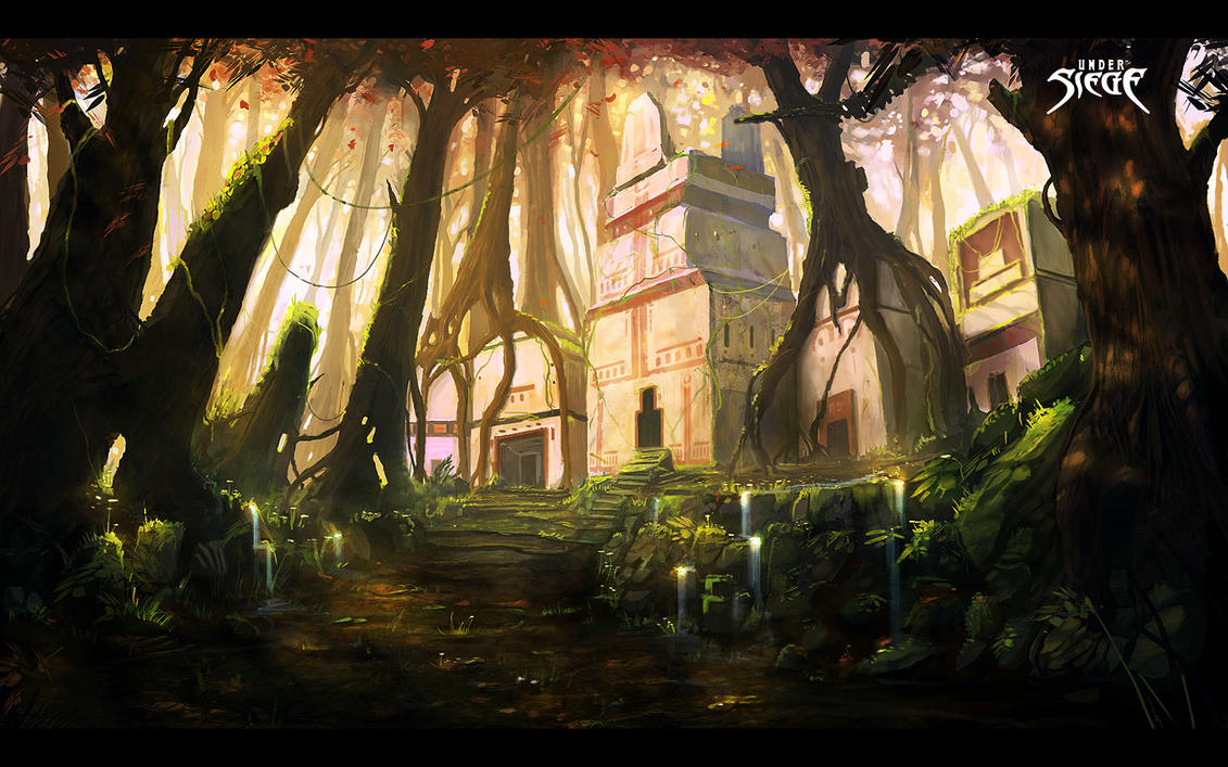
Natural world.
This is a piece from my favourite landscape concept artist
at the moment. His name is Jorge Jacinto, 23, from Portugal. He is a free-lance
artist and has done pieces on several games, films and book covers etc, like
this one ‘Under siege’. He also records some his paintings, speeds them up, and
uploads them on youtube, here’s a link: http://www.youtube.com/watch?v=nwXp27_PLyU&feature=plcp
My first and most favourite thing about this painting is the
lighting. Its very warm and pleasant, and gives the image a happy feeling. This
isn’t a dark an horrible place and the lighting shows that. Everything is really soft and peaceful, if
this was a dark, and dangerous place there would be a lot of spikes everywhere,
dark colours like red, grey and black. Some fire maybe. Another thing I really like is the lighting
coming through the leaves and hitting the tree on the far right. It makes the
image really real and believable while giving it a really nice effect. I think
the trees growing over the buildings give the image a rather old an ancient
feel. Maybe the place has been abandoned for a long period of time, or the
trees have a really fast grow rate? I think the lighting coming from the left
really makes the image stand out a lot, he has thought about the composition
really well in this piece.
The artist probably got some ideas for the buildings by looking into things like the Aztec's, that sort of culture. Maybe Egypt also.

This is another piece from the same artist as above. The artist would've had to look into the real world to get ideas for this image because in my mind, this looks a lot like Tokyo, or china. So he probably looked at the buildings that are there and tried to manipulate them into his image. You can also see in the foreground (top left and right) some roofs that have an asian culture.
Tokyo consists of a lot of skyscrapers and thousands of lights at night, and he has manipulated this into his drawing very well.

This is from a concept artist called Feng Zhu. He runs a college course teaching concept art in Singapore, but is also a freelance artist. He is very well known in this industry and on youtube for his tutorials and speed paints, and is also another one of my favourite artists.
My favourite thing about this image is the size and scale it gives, along with some really great colours. He tricks your mind by using the same buildings used in the foreground and placing them in the background , but making them a lot smaller and less saturated making your mind think its far away. This gives the image a sense of space and scale which is really clever. Also, as he has placed people in his image, we can relate to how big they are compared to the buildings, this is a really clever technique, it makes us imagine the size of the buildings more easily. You can tell in this image that he has placed images over his painting to give him colours, detail, and also to increase his workflow, but it does give it a nice effect and works well. Also giving this image a low horizon line has further more increased the size and scale of buildings making you look up at them.
Article

Environment
I think this image gives a really nice calm and peaceful effect to it. He has used really pale and light colours , nothing heavy with puts a soft feel onto it. The way the lighting hits the building from the left makes the image stand out a lot. He has layed out the image very well, it has a great composition. The forgegroungd also suggests that it may be inside some kind of cave which is opening out into some kind of forest, or shrine. Maybe thats why the forground is really dark and the light is hitting the building. But it makes the building stand out making it the selling point of the image. I also like the way the foreground kind of curves up-words making you feel like your in a cave with a roof above you.
The building looks a little old too, it has grass/moss growing on it. Also the front of it by the water looks like its worn down, or collapsed. The textures he's used on it gives it a kinda of worn down feeling about it. But yet it still looks like a holy place, or a place of importance. It also has a really good perspective, making you feel like your looking up at it, or its towering over you. The low horizon line also helps with this effect. By placing a person in the image helps with the scale of the image, because we can look at the person and know how big they are, then compare them to the building or the rocks, and it makes them look massive. The trees in the background look like they are really far away as well, he has achieved that effect by making them a really light colour, with no detail. By placing things in front of them like the building with a lot of detail, it makes the trees seem far away.

The building looks a little old too, it has grass/moss growing on it. Also the front of it by the water looks like its worn down, or collapsed. The textures he's used on it gives it a kinda of worn down feeling about it. But yet it still looks like a holy place, or a place of importance. It also has a really good perspective, making you feel like your looking up at it, or its towering over you. The low horizon line also helps with this effect. By placing a person in the image helps with the scale of the image, because we can look at the person and know how big they are, then compare them to the building or the rocks, and it makes them look massive. The trees in the background look like they are really far away as well, he has achieved that effect by making them a really light colour, with no detail. By placing things in front of them like the building with a lot of detail, it makes the trees seem far away.
Creature
This is a really cleverly designed creature. I really like the way his has used humans on the creature, I think It adds a really cool effect, but yet scary and disturbing as well. I quite like the techniques he's used to paint this too. When you look at this image I think your eye goes straight to the mouth, or at least that area. So that's where he's concentrated on the detail, everything away from the area you can see doesn't have too much detail, just simple brush strokes which you can see.
I think the colours he's used makes the image a lot more intimidating, the reds make it a dark and scary creature that you would be afraid of. If he had used light colours like blue, yellow, or green it wouldn't seem as scary. Although a dark green would still give it a nice effect. Also I think the bodys trying to crawl away from the monster underneath looks really cool. Also as it looks like there trying to escape, makes the creature seem a lot more scary.

Character
The colours in this image really reflect on what kind of character this person is. The colours used are blues and yellows/gold. These are light and soft colours, automatically saying that this isn't a bad character, he is not evil in anyway. The background and his armour also back that up. The pillars have a roman nature about them, or holy, but definitely not evil. His armour is gold, showing power, royalty, also the way he is standing is quite proud and strong, showing that he is someone powerful. The blue things coming out of his back kind of look like wings in a way, maybe he's an angel? Also his head and upper body seems to be lit up, or lighter than everything else in the image, the artist obviously wanted to make this the vocal point.

Object
Here is some concept art for a set of armour and weapons. The first things I see when I look at this is evil, dark, scary. I think this is because the style is quite chaotic, it has a lot of sharp edges, lots of greys and blacks. Also the fire gives it another level of evil, fire is an instant indicator of evil and bad. The thing that wears and uses these things is something that should never be made your enemy. I think the fire gives a nice effect to the armour though, it brings it out more while keeping the evil factor. The weapons also seem quite big, they have really big blades with massive handles hinting that they are big, which means the things that uses these must also be big, or very strong at least, which then shows a sense of power or something to be afraid of.
This is a really cleverly designed creature. I really like the way his has used humans on the creature, I think It adds a really cool effect, but yet scary and disturbing as well. I quite like the techniques he's used to paint this too. When you look at this image I think your eye goes straight to the mouth, or at least that area. So that's where he's concentrated on the detail, everything away from the area you can see doesn't have too much detail, just simple brush strokes which you can see.
I think the colours he's used makes the image a lot more intimidating, the reds make it a dark and scary creature that you would be afraid of. If he had used light colours like blue, yellow, or green it wouldn't seem as scary. Although a dark green would still give it a nice effect. Also I think the bodys trying to crawl away from the monster underneath looks really cool. Also as it looks like there trying to escape, makes the creature seem a lot more scary.
Character
The colours in this image really reflect on what kind of character this person is. The colours used are blues and yellows/gold. These are light and soft colours, automatically saying that this isn't a bad character, he is not evil in anyway. The background and his armour also back that up. The pillars have a roman nature about them, or holy, but definitely not evil. His armour is gold, showing power, royalty, also the way he is standing is quite proud and strong, showing that he is someone powerful. The blue things coming out of his back kind of look like wings in a way, maybe he's an angel? Also his head and upper body seems to be lit up, or lighter than everything else in the image, the artist obviously wanted to make this the vocal point.
Object
Here is some concept art for a set of armour and weapons. The first things I see when I look at this is evil, dark, scary. I think this is because the style is quite chaotic, it has a lot of sharp edges, lots of greys and blacks. Also the fire gives it another level of evil, fire is an instant indicator of evil and bad. The thing that wears and uses these things is something that should never be made your enemy. I think the fire gives a nice effect to the armour though, it brings it out more while keeping the evil factor. The weapons also seem quite big, they have really big blades with massive handles hinting that they are big, which means the things that uses these must also be big, or very strong at least, which then shows a sense of power or something to be afraid of.